Using the :has selector to display full with of a container
The :has selector can be used to make a 100% iframe's container to be also 100%

Finally, today I had a use-case for the :has selector which was first supported by Safari as reported by Jen Simmons.
I have this in my base.html :
<div id="main" class="grow mx-auto px-4">
    {% block content %}{% endblock %}
</div>
which has the container to the block content as mx-auto which translates to margin-left: auto; margin-right: auto; for all pages including the events page.
And this in events.html
{% extends 'base.html' %}
{% load static %}
{% block content %}
<div id="events-page" class="p-7 mt-5 w-full">
<div>
<h2 class="text-4xl pb-4 mb-4 border-b border-gray-200">Events</h2>
<div>
<div class="px-4- sm:px-6- lg:px-8-">
<div class="sm:flex sm:items-center">
<div class="sm:flex-auto">
<h1 class="text-xl font-semibold text-gray-900">Events</h1>
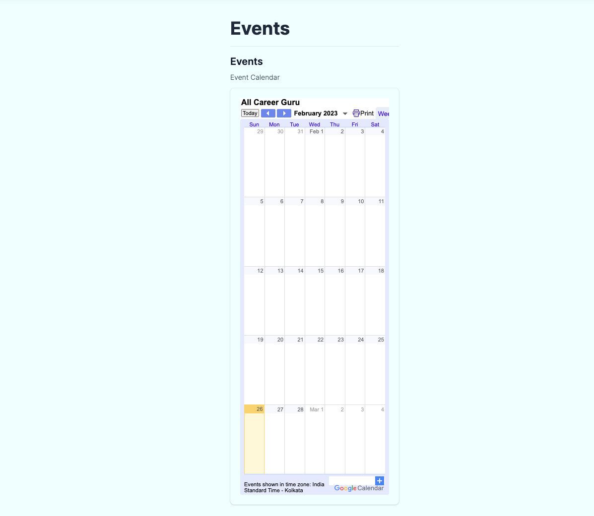
<p class="mt-2 text-sm text-gray-700">Event Calendar</p>
</div>
</div>
<div class="-mx-4 overflow-hidden shadow ring-1 ring-black ring-opacity-5 p-5 sm:-mx-6 md:mx-0 md:rounded-lg w-full">
<iframe src="https://calendar.google.com/calendar/embed?src=newsletter%40allcareerguru.com&ctz=Asia%2FKolkata" style="border: 0" width="100%" height="800" frameborder="0" scrolling="no"></iframe>
</div>
</div>
</div>
</div>
</div>
{% endblock %}
Thing is, with the iframe not being 100% of the page is not exactly aesthetically pleasing. The iframe needs to be 100% of the container, and the container is not the full-width of the page.
So, I want the main DIV not to be margin-left: auto; margin-right: auto; and instead be margin-left: 0; margin-right: 0;
So after {% block content %} all I added was :
<style type="text/css">
#main:has(#events-page)
{
    margin-left:0;
    margin-right:0;
}
</style>
Now this makes only the event page's container (#main) to not have margin-left: 0; margin-right: 0; which overrides mx-auto
FireFox is yet to support :has (https://caniuse.com/css-has) ! The browser I work on exclusively!


